


 User Center
 My Training Class
 Feedback


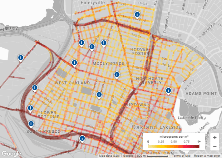
Google Maps has just launched its first map showing the air quality right down to the block you are standing on in Oakland, California.
The project is in partnership with the Environmental Defense Fund (EDF) and Aclima, a pollution sensor startup it has been working with to map environmental changes in the Bay Area, Central Valley and Los Angeles since 2015.
Google strapped Aclima sensors to its StreetView cars shortly after it began working with the company and its maps can now give you street-level data in areas with higher amounts of nitric oxide (NO), nitrogen dioxide (NO2) and black carbon — all pollutants coming from car exhaust.
One good example of how the map can help environmental scientists in the Bay Area is the ability to track higher pollution due to cars speeding up near the Bay Bridge to cross under or merge onto I-80, which is a freeway with frequent traffic congestion that goes beyond just rush hour and can sometimes even be affected on the weekends.
In a Google blog post, out today, Google claimed its pollution data set to be the largest ever published, “With nearly 3 million measurements and 14,000 miles captured in the course of a year,” and said it could apply the data to other cities in the future.


Comments
Something to say?
Log in or Sign up for free